 newsoholic Time to become News Oholic!
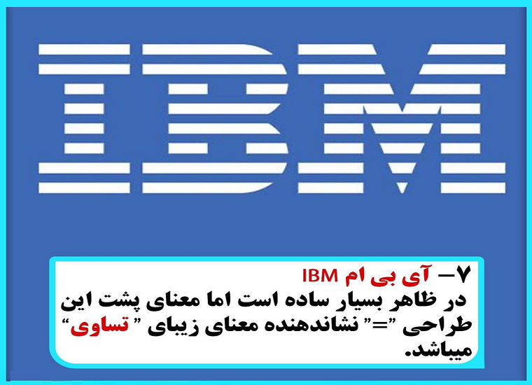 Equality for all
The IBM logo that we know and love has the three letters of the brand’s name written in a big serif font with horizontal lines of whitespace running through it, breaking the logo up. The reason behind the horizontal lines is due to the fact that early photocopies had difficulties reproducing large blocks of solid ink. The original logo had thirteen lines going through it, but that number was reduced to eight because (ironically enough) the original thirteen caused ink bleeding issues in the company’s print media.
Equality for all
The IBM logo that we know and love has the three letters of the brand’s name written in a big serif font with horizontal lines of whitespace running through it, breaking the logo up. The reason behind the horizontal lines is due to the fact that early photocopies had difficulties reproducing large blocks of solid ink. The original logo had thirteen lines going through it, but that number was reduced to eight because (ironically enough) the original thirteen caused ink bleeding issues in the company’s print media.
The Hidden Meaning Of The Most Famous Logos
Equality for all
The IBM logo that we know and love has the three letters of the brand’s name written in a big serif font with horizontal lines of whitespace running through it, breaking the logo up. The reason behind the horizontal lines is due to the fact that early photocopies had difficulties reproducing large blocks of solid ink. The original logo had thirteen lines going through it, but that number was reduced to eight because (ironically enough) the original thirteen caused ink bleeding issues in the company’s print media.